 Enlarge
Lars Bo
Exhibition Lars Bo
A certain emotion accompanies me at the exhibition devoted to Lars Bo; indeed, it is not every day that one has the chance to visit an exhibition of an artist some of whose works one owns! And yes, it rather changes one's perception: a feeling of closeness and intimacy accompanies the visit.
All the more so as it was not art history that led me to him but my own research.
For his biography, here is the link from the Galerie Champetier, thanks to which I discovered him. Lars Bo biography
And the booklet of the February 2026 exhibition
Lars Bo booklet — 2025 exhibition
To be brief and spectacular, one could write that his participation in the Danish resistance links him to history, and that Jacques Villon, who encouraged him to continue on his path, connects him to the history of art.
What artist today would not dream of being able to claim armed combat against the Nazis instead of a signature at the bottom of a courageous petition, and of being knighted by the brother of Marcel Duchamp rather than by an obscure secretary-general of a FRAC?
The exhibition is organised in two parts: on one side the works, The Engraver and the Spells; on the other The Making of the Print, with the plates, tools, proofs and artefacts of printmaking.
Moving from one to the other allows one to approach the creative process, at least from the technical point of view. The deep relationship with the materials — ink, paper, copper — intimate and repeated from proof to proof, is well conveyed. One senses the drawings in their raw forms, and their finished forms appear in the part devoted to the works.
The accumulation of copper plates and their sizes alone date the period in which the artist was working, and even seem anachronistic given the current price of copper.
No better for zinc!
The choice to present certain prints in enlarged versions is a little strange, since the specific character of printmaking is lost. All the more so as there are a few medium formats... A search for the spectacular?
Yet the graphic universe is spectacular enough in itself
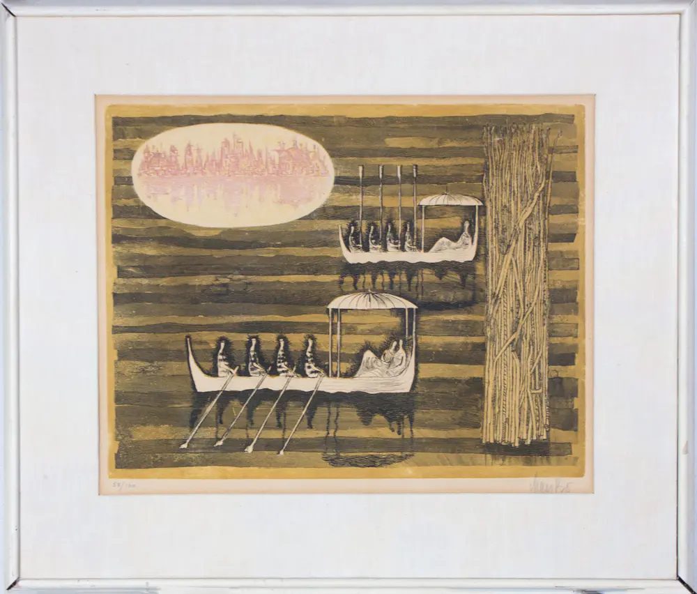
The illustrations stage human and animal figures, sometimes chimeras, sometimes naturalistic, in dreamlike landscapes where flying carts and nuptial galleys never fail to turn up...
The line is light but always spiced with tension, even with eroticism. The pretext for the illustrations is to be found in European literature: Kafka, Gogol, Andersen.
A great freshness shows through; is it not because these prints still breathe a thoroughly European psyche?
The American and Japanese mental universe had not yet colonised — the period being what it was — these illustrations, dated but free of the classicisms of manga, kawaii or Marvel superheroes and company that shape our ways of seeing today.
I feared that the prices of the prints would have risen sharply after this time in the spotlight, but prices have remained remarkably stable.
Collectors, take note!